Slots
Slots are placeholders declared by a component that you can fill up with custom content.
In order to declare a slot, you must use the slot macro:
slot name, options
Where:
-
name- is the name of the slot. -
options- a keyword list of options for additional customization.
Supported options
-
required- declares the slot as required. Default isfalse. -
arg- an atom or map defining the type of the argument that will be passed to the associated slotable content. -
as- defines the slot assign name. Useful if you want to reuse the slot name as a prop. -
generator_prop- property that will be used as generator for this slot.
Rendering content with <#slot>
Slots are similar to properties as they are exposed as part of the component's public API. The main difference is that while properties are passed as attributes, slots are injected inside the component's body.
To declare a slot, you must use the slot macro and provide a name to the slot.
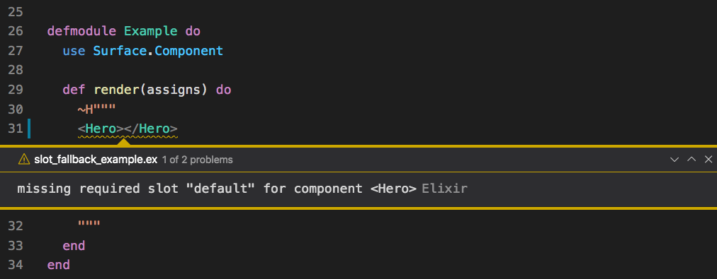
In the example below, the slot default is declared as required.
defmodule Hero do
  use Surface.Component

  @doc "The content of the Hero"
  slot default, required: true

  def render(assigns) do
    ~F"""
    <section class="hero is-info">
      <div class="hero-body">
        <#slot />
      </div>
    </section>
    """
  end
end
The user can now use the <Hero> component and fill it with custom content.
If the user tries to use the Hero component without defining any content, a
missing required slot "default" error will be raised at compile-time.
Fallback content
Sometimes it’s useful to specify a fallback content that should be rendered when no content is provided for a slot.
defmodule HeroWithFallbackContent do
  use Surface.Component

  @doc "The content of the Hero"
  slot default

  def render(assigns) do
    ~F"""
    <section class="hero is-info">
      <div class="hero-body">
        <#slot>
          No content defined!
        </#slot>
      </div>
    </section>
    """
  end
end
If at least one child element is defined inside <#slot>...</#slot>, the inner content is used as the default content for that slot.
Note that we removed the required option in the slot declaration. If we had not done so,
a warning would inform you that the fallback content would have no effect, thanks to the compiler!
Named slots
In the previous example, we defined a component with a single default slot. But what
if you need to define multiple slots? A classical example of such requirement is the Card
component. A card usually has three distinct areas, a header, a footer and the
main content.
In order to create a component that can represent a card, we need to use named slots. Let's take a look at how it works.
A simple card component
As you can see in the example, we are assigning 3 slots:
- The header slot
- The default slot that contains everything that is not in any other slot
- The footer slot
And finally our Card component defining all three slots:
defmodule Card do
  use Surface.Component

  @doc "The header"
  slot header

  @doc "The footer"
  slot footer

  @doc "The main content"
  slot default, required: true

  def render(assigns) do
    ~F"""
    <div class="card">
      <header class="card-header" style="background-color: #f5f5f5">
        <p class="card-header-title">
          <#slot {@header} />
        </p>
      </header>
      <div class="card-content">
        <div class="content">
          <#slot />
        </div>
      </div>
      <footer class="card-footer" style="background-color: #f5f5f5">
        <#slot {@footer} />
      </footer>
    </div>
    """
  end
endNote: Pay attention that defining a
<#slot />without a name is the same as defining it as<#slot {@default} />.
Detecting optional slots
If you need to conditionally render some content depending on whether an optional slot is defined or not,
you can use slot_assigned?/1.
defmodule HeroWithOptionalFooter do
  use Surface.Component

  @doc "The content of the Hero"
  slot default

  @doc "An optional footer"
  slot footer

  def render(assigns) do
    ~F"""
    <section class="hero is-info">
      <div class="hero-body">
        <#slot />
      </div>
      <div :if={slot_assigned?(:footer)} style="padding:5px; border-top:2px solid #f5f5f5;">
        <#slot {@footer} />
      </div>
    </section>
    """
  end
end
Without assigning the slot:
Hello! No footer for me.
Assigning the slot:
Hello! Check out the footer.
©2021
Typed slotables
Instead of using <:slot>, you might want to define a custom component to
hold the slot's content. In our case, we can define a <Footer> and a <Header>
component, setting the :slot option as the name of the slot in the parent card.
defmodule Header do
  use Surface.Component, slot: "header"
end

defmodule Footer do
  use Surface.Component, slot: "footer"
end
To use them, we don't have to change anything in the Card component. We just need to replace each <:slot>
with the appropriate Footer or Header component.
A simple card component
One benefit of using typed slotables is that you can define properties for them just like you'd do for any other component, allowing the user to pass extra information to customize the rendering.
The <Footer> and <Header> components above are called "Renderless Slotables" as they don't implement
the render/1 callback. A renderless slotable is mostly used when you just need a declarative way to
assign slot contents along with some additional properties. The slotable, however, is not responsible
for any kind of rendering as this task is fully delegated to the parent component.
More details and a more elaborate example is presented in the Renderless Slotables section later on.
Implementing render/1
By implementing the render/1 callback, you can customize the content of the slot with extra markup,
allowing users to apply a different behaviour or look for the same slot.
For example, you could have different headers for the Card component.
A fancy card component! 😉
Slot arguments
There are cases when it's necessary to pass information from the child's scope to the corresponding slot content that is being injected by the parent. Using slot arguments, Surface gives you an extra layer of encapsulation as it allows you to expose only the pieces of data that the parent needs, keeping everything else in the child's scope private to the parent.
Imagine you're developing a new component that you need to show some ratings.
It should provide predefined buttons to increment/decrement its value but you want
to make the rendering of the value itself customizable so you can, let's say, show
it as a number in one page and as a list of stars in another. You also want to
define a property for the max value.
Let's see the code:
defmodule Rating do
  use Surface.LiveComponent

  @doc "The maximum value"
  prop max, :integer, default: 5

  @doc "The content"
  slot default, arg: %{value: :integer, max: :integer}

  data value, :integer, default: 1

  def render(assigns) do
    ~F"""
    <div>
      <p>
        <#slot {@default, value: @value, max: @max} />
      </p>
      <div style="padding-top: 10px;">
        <button class="button is-info" :on-click="dec" disabled={@value == 1}>
          -
        </button>
        <button class="button is-info" :on-click="inc" disabled={@value == @max}>
          +
        </button>
      </div>
    </div>
    """
  end

  def handle_event("inc", _, socket) do
    {:noreply, update(socket, :value, &(&1 + 1))}
  end

  def handle_event("dec", _, socket) do
    {:noreply, update(socket, :value, &(&1 - 1))}
  end
endNote: for simplicity, the example here does not implement any kind of validation on the backend nor any blocking on the client to prevent multiple clicks leading to a negative
value. The goal is just to explain how slots work. In production, your should probably do both.
Now let's create two instances of our Rating component, each one rendering its
value differently.
Rating: 1
Renderless components
There are cases when you don't need to render any of the children of a specific component. You just want to use them as a list of values that can be retrieved so you can provide a more declarative way to configure that component.
Imagine you want to define a Grid component but instead of defining a property to pass
the columns definitions, you want to extract that information directly from the component's body.
In order to achieve that, you can define a Column component and use the :slot option to
inform that any instance will be bound to a parent slot.
By doing that, the component will no longer be rendered automatically. The list of children belonging to the same slot will be grouped and become available to the parent as an assign. The parent then decides what should be done with each individual group (slot).
Here's an example:
| Name | Artist | Released |
|---|---|---|
| The Dark Side of the Moon | Pink Floyd | March 1, 1973 |
| OK Computer | Radiohead | June 16, 1997 |
| Disraeli Gears | Cream | November 2, 1967 |
| Physical Graffiti | Led Zeppelin | February 24, 1975 |
Here are the Grid and Column components:
defmodule Column do
  use Surface.Component, slot: "cols"

  @doc "The field to be rendered"
  prop field, :string, required: true
end

defmodule Grid do
  use Surface.Component

  @doc "The list of items to be rendered"
  prop items, :list, required: true

  @doc "The list of columns defining the Grid"
  slot cols

  def render(assigns) do
    ~F"""
    <table class="table is-bordered is-striped is-hoverable is-fullwidth">
      <thead>
        <tr>
          {#for col <- @cols}
            <th>{Phoenix.Naming.humanize(col.field)}</th>
          {/for}
        </tr>
      </thead>
      <tbody>
        {#for item <- @items}
          <tr class={"is-selected": item[:selected]}>
            {#for col <- @cols, field = String.to_atom(col.field)}
              <td>{item[field]}</td>
            {/for}
          </tr>
        {/for}
      </tbody>
    </table>
    """
  end
end
By defining a named slot cols, we instruct Surface to create a new assign named
@cols that will hold a list containing all children that belong to the slot cols.
Note: As you can see, the
Columncomponent does not render anything. It just holds the provided values for its properties. All the rendering is done by the parentGrid.
Slot generators
Imagine that instead of passing the field related to the column, you want to define some markup that should be rendered for each column. This would give us much more flexibility to render the items. Here's an example of what we could do.
| Title | Artist |
|---|---|
| The Dark Side of the Moon (Released: March 1, 1973) | Pink Floyd |
| OK Computer (Released: June 16, 1997) | Radiohead |
| Disraeli Gears (Released: November 2, 1967) | Cream |
| Physical Graffiti (Released: February 24, 1975) | Led Zeppelin |
Notice that we're not passing a regular list to the property items anymore, instead, we are
passing a generator that defines a variable called album. That variable will hold
the value of each item in the list that will be passed back to the column's scope by the
parent Grid.
Note: Currently, Surface only support generators defining a single variable. Optional filter expressions are also supported. The concept of generators and filters is the same used by comprehensions in Elixir. For more information, see the section Generators and filters in the Elixir official documentation.
Here's the updated version of the Column and Grid components:
defmodule Column do
  use Surface.Component, slot: "cols"

  @doc "The title of the column"
  prop title, :string, required: true
end

defmodule Grid do
  use Surface.Component

  @doc "The list of items to be rendered"
  prop items, :generator, required: true

  @doc "The list of columns defining the Grid"
  slot cols, generator_prop: :items

  def render(assigns) do
    ~F"""
    <table class="table is-bordered is-striped is-hoverable is-fullwidth">
      <thead>
        <tr>
          {#for col <- @cols}
            <th>{col.title}</th>
          {/for}
        </tr>
      </thead>
      <tbody>
        {#for item <- @items}
          <tr class={"is-selected": item[:selected]}>
            {#for col <- @cols}
              <td><#slot {col} generator_value={item} /></td>
            {/for}
          </tr>
        {/for}
      </tbody>
    </table>
    """
  end
end
Let's take a closer look at the two important changes we made in our Grid:
-
The
colsslot now referencesitemsas thegenerator_prop. -
We use
<#slot>to render each column's content passing the current item as thegenerator_value.
Note: Surface Slots are implemented as regular LiveView Slots. The
<#slot>component is basically a wrapper aroundrender_slot/2that allows extended features like contexts and generators. For instance<#slot {@default, @form} />is analogous torender_slot(@inner_block, @form).